MyGuitare
.png)
Brief
MyGuitare is the largest and fastest growing guitar learning platform in France, with over 200,000 registered users. The company had been focusing on growth, leaving the platform lagging behind from both a functional and design standpoint. New features were built on top of a temporary solution, which now stands too tall to demolish and reconstruct without a solid design direction.
Goal
Establish a design system, refresh the UI across the platform and design for new features.
This project is part of a larger mission that also includes the rebrand of MyGuitare, and the redesign of their marketing website.
This case-study will specifically focus on the platform.
Role
As the Product Design Lead, I initiated and supervised most of the design effort, as well as facilitated the hand-off and early development of the platform. As per usual through castlelab, I was also responsible for most business exercises (including selling, project scoping, requirements gathering, onboarding).
Team
- Charlotte Chen, UX Designer
- Natalia Tarasova, UI Designer
- Nick Lighter, Project Coordinator
- Abdellah Rholem, Branding
- Yuki Nishida, Product Designer
- Leo Chazalon, Lead Product Designer
SNAPSHOT OF
DELIVERABLES


EMPATHIZING
Problem Context
There are plenty of learning platforms out there for guitar enthusiast, the challenge lies in keeping a user motivated throughout their learning journey.
Project Hypothesis
We believe the roadmap to learning guitar isn't clear, making users feel lost as to where to start or continue from. We are also aware from the client that users are having a hard time seeing success and measuring progress.
Project Goals
The goal is to understand guitar learners more holistically, their motivations and fears in life, then to investigate their experience on the platform so that we can remove those painpoints and help them achieve their life-long dream of playing guitar.
User Interviews
We came up with a persona that helped us empathize with the end-users beyond their experience on the platform. Sebastien served as a reference point for making design decisions and aligning internal discussions (research done in French with help of Branding specialist - Pascal Stefani).

Interview Insights
Themes & Actionable Insights
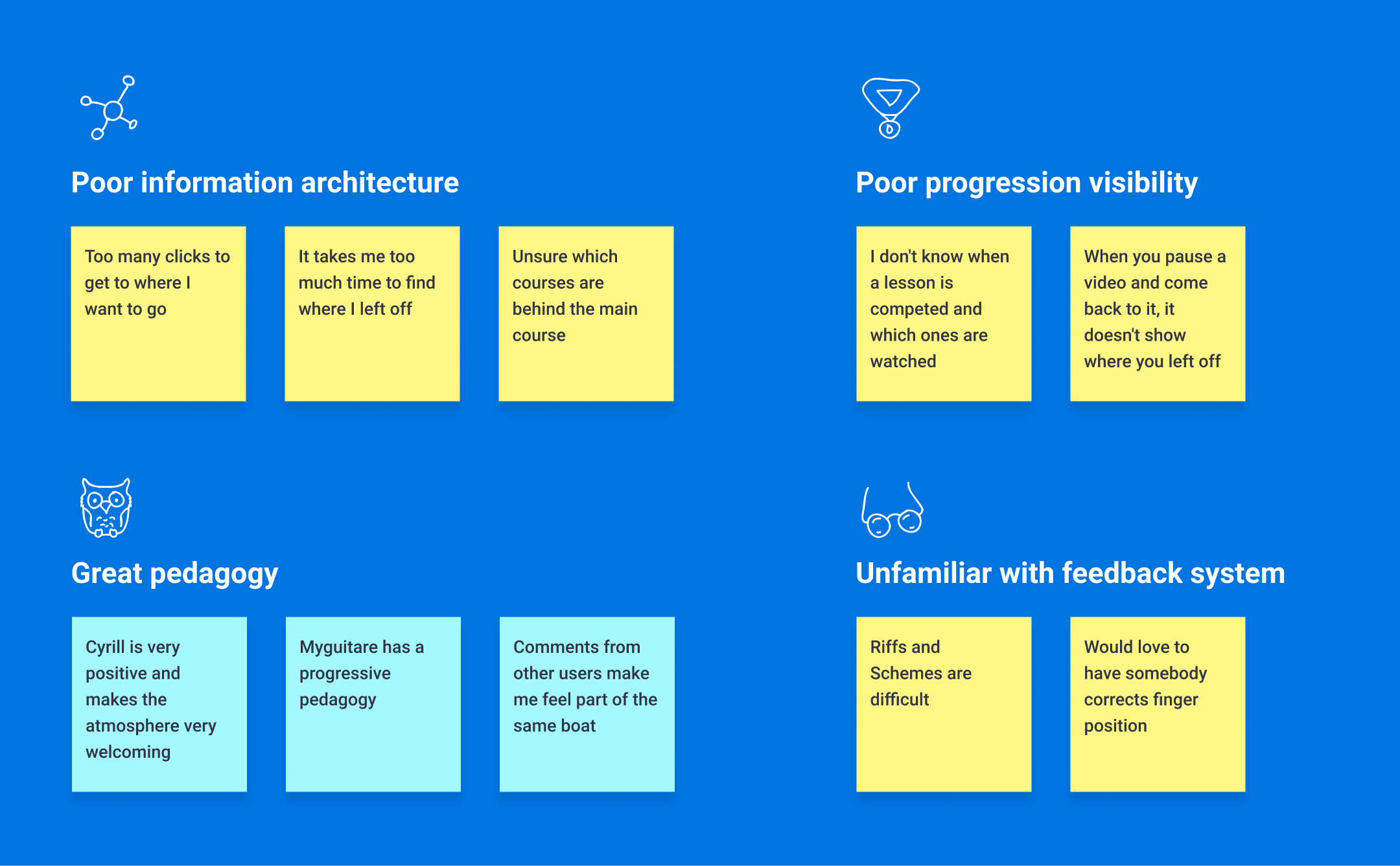
- Users are getting lost on the platform
- Users are hardly seeing progress
- Users are unfamiliar with the dedicated feedback system
- Users love the MG pedagogy ("Cyrille is amazing")
- Users have mixed feelings about the community features
I'm only showing a few themes here, but interviews revealed a lot more concerns about specific parts of the platform or the learning journey. For example, users had mixed feelings about the Community feature, which is like a forum for all members of MyGuitare, where people discuss anything from 'wins of the day' to bugs.
Business Needs & Constraints
Good user experience involves making compromises. We work off an existing business modal with strengths and weaknesses that we need to account for when redesigning the platform. Typically, the budget is big constraint, but here are a few relevant ones:
Opportunities
- Users are welcoming and passionate about guitar
- Offers diverse courses
- Founding team is very close to end-users
- Has low costs
Constraints
- A single teacher
- Relies on user self-discipline
- Users switch courses before completion (low )
Competitive Analysis
We audited 5 high-performing platforms (French & English platforms) to shed light on industry standards, and opportunities to tailor our platform for users like Sébastien. Our insights are summarized below.
- Goal Driven. Competitors have gamified the learning experience, attaching goals to specific rewards, like badges and trophies. They are trying to keep the user focused and motivated through challenging times using visual cues that make it easy to notice progress, like progression bars.
- Good information architecture. There is a clear hierarchy in content, putting key information at the forefront (to be seen at a glance) while the second layer of content remains accessible but is more contextual. Lots of white space too.
- Social. Music has a strong social nature, many learners are looking to entertain and connect with their circle through music. The learning experience therefore extends beyond the main channel. Users are encouraged to share their achievements with the platform users as well as with friends. It's important that you get positive feedback, however constructive, because it boosts your motivation to come back and learn.
- Omnipresent. There platforms create a mini-world around the learning experience such that you never feel bored or lost. They use follow-up messages to offer tips and resources, as well as push notifications with friendly reminders to keep momentum and build trust.
DEFINE
The platform redesign was so large in scope already that we divided it into version releases. Version 1 would be the most important. It includes the redesign of the platform's most primary functionalities, and using the new brand identity we made alongside Abdellah, we create its UI library to accommodate and speed up future additions. The social features of the platform, considered secondary to the learning experience, were therefore pushed to V2. This case-study deals only with V1. With our research synthesized, all stakeholders agreed on the following scope for our first deliverable:
Rethink the information architecture.
Based on the research showing users were taking a long time to reach their intended screen or feature. Users also complained about the taxonomy of content (course vs module vs part), which resulted in significant refunds.
Redesign fundamental user flows
Based on the research showing users were experiencing painpoints at crucial moments during the learning and buying experience, among others.
Establish a design system
A design system that aligns with the new brand identity we crafted.
DESIGN
Rethink the information architecture
Our user interviews showed that users were confused about taxonomy and the grouping of information. Comments like "I'm unsure which courses belong to the main course" specifically meant that the relationship between a module and its course were misunderstood.
The client team was also receiving many support tickets and refund requests from users who had unintentionally purchased the wrong course.
We made a class diagram, a concept taken from Software Programming, which describes the structure of a system by showing its classes, their attributes, operations (or methods), and the relationships among them.
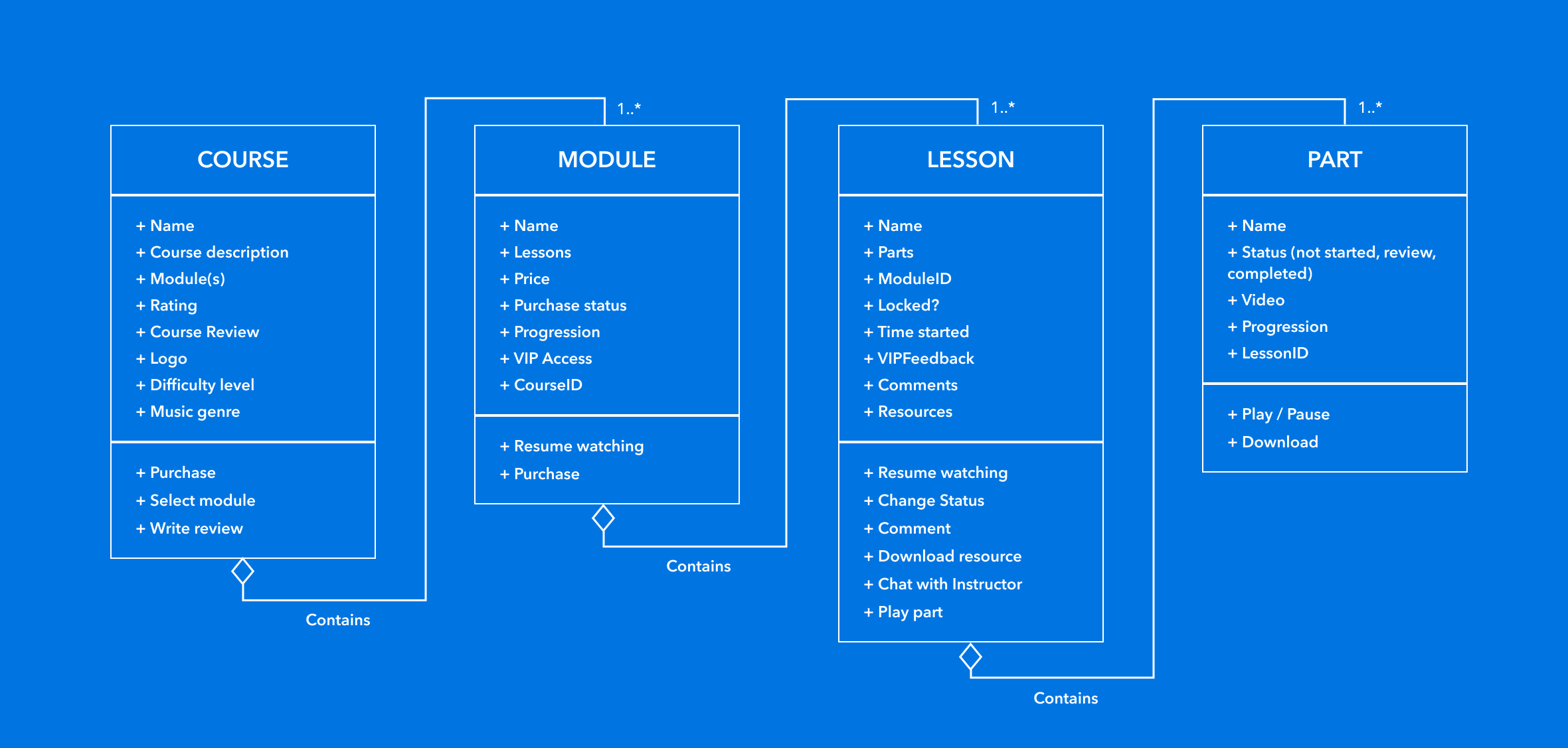
From there, we were able to quickly identify inconsistencies (e.g. repeated taxonomy) and the most complex relationships for users.
Some of the main changes to the platform architecture were:
- Removed 'subparts' from videos as separate entities
- Removed certain actions from lower level units (e.g. commenting on 'Parts')
- Created separate UIs for the different groupings (see section below on 'Browsing Modules')
Outcome after 4 months:
- Decreased refund requests by 33%
- Decreased support tickets by 19%
Redesign fundamental user flows
We were responsible for redesigning the entire platform; below are only some selected parts that I deem most interesting.
Onboarding
A painpoint we gathered was that users are typically eager to learn but are confused which course to start with.
We found that taking new users through a short quiz about their previous guitar experience & aspirations would allow us to suggest more relevant courses, and ultimately to keep them engaged longer.
After 4 months, we noticed:
- Cut 'Time to first lesson' from 8 to 5 minutes
- Decreased course dropout rate at week 1 by 16%
- Decreased support tickets by 19%
Course Navigation & Learning
The old learning dashboard had a layout that worked for most users. Our goal was to refresh and standardize it, as well as add a few features that we gathered from our user interviews.
The first feature is a better way for users to track their progress. We already had a progress bar that automatically updated itself, but we identified that users wanted additional control over it. Specifically, users wanted to be able to label lessons themselves for future reviews.


.png)
The client also wanted to run an experiment in order to decrease the number of 'course dropouts'. In essence, the platform would now block users from watching future lessons until they had:
- Watched the previous lessons
- AND waited a week since the previous lesson
The client was hoping to control new users' learning pace, knowing that many of them skipped through content which ultimately increased the chance of feeling lost later on and dropping out.
Our solution aims to provide just enough information to educate new users about the two conditions that are necessary for continuing to the next lesson, and without adding obstacles to the older users that are already aware of this rule and who most likely want more control over their learning.

Browse modules from a course
A course is made of several Modules, and a user can decide to purchase only some of them. Similarly, video game library @Steam provides 2 ways of accessing their equivalent of modules for a game, called 'packs' or 'modes'. You can search them via the public marketplace where game profiles are infused with marketing visuals to make you buy it. There, you can select a specific pack. The second way to access them is once you have already purchased parts of the game. In the 'purchased' game profile, you find other packs along with data about your progress on the packs you've purchased.
@Steam did it so well, we had to copy and adapt it to MyGuitare. So in addition to the All Courses list, we designed a dedicated UI for a Course when it is fully or partly purchased.
.png)
Checkout and Plans
The business goals were to streamline the checkout experience and help users discover add-ons and alternative payment plans. Those objectives translated into the following design efforts:
- Creating Focus (no outside links or distractions)
- Easier navigation across checkout
- Plugging the add-ons at relevant moments in the flow
- Designing for clarity of information (less surprise cost or refund requests)
.png)
After 4 months, we noticed:
- Cut time to checkout from 12 to 6 minutes
- Enabled 200+ purchases using alternative payment plans
- Decreased refund requests by 33%
Establishing a Design System
With multiple designers working simultaneously on the project, a robust and flexible design system was necessary in maintaining consistency. Yuki took the lead in establishing the design system, communicating rules and expectations to the team, and monitoring the component library.

LEARNINGS
Divide and conquer
Our strategy for tackling the platform redesign was far from optimal. The entire team worked together one screen at a time, starting with the important ones. The problem there is we forgot to think of screens as part of a larger experience spanning different user activities. We ended up taking a much longer than expected. Later into the project, we switched strategy and assigned each designer to a userflow, giving ownership of the end-results while following a team-reviewing mechanism.
Explore outside the persona
We interviewed only a single person under 36y, which explains why one of the most recent user feedbacks we got about the new website is that our hero section mascot is looking 'old' to some web visitors. Although the client has specified he wanted the platform to appear to his primary user (retired men), we should have explored the needs of users outside the traditional userbase traits and imagined a platform of which the design is flexible enough to change and appeal to younger users.
The relevance of UI vs UX
Our UI designer was taking part in experience design exercices, while our UX designer also spent significant time on visual design. I believe that on small projects, it's better to differentiate between Senior vs Junior product designer, than to differentiate and hire based on UI vs UX expertise.
Leader M.I.A
At times, we were missing a clear sense of direction and ownership, due in part to a member quitting halfway through. Leaders should be designated early, bear the responsibilities of their role and should pause whatever they're working on to prioritize laying solid foundations and unblocking teammates.
--------
Updated January 12, 2020
We're leading a second round of user research in January 2021 to evaluate the impact of new designs and prioritize capabilities.